.png)
The world map is changing.
Published: 09:08 PM, 5 September 2026
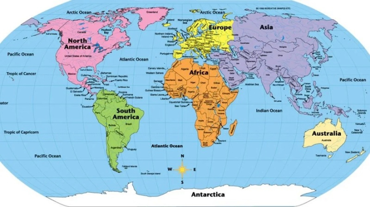
Many countries and continents appear to be as large or small as they appear on our familiar maps, but in reality they are completely different. For example, when you look at the North American island of Greenland on a map, it seems like a huge area, just as big as the entire continent of Africa!
But the real truth is that the African continent is about 14 times larger than Greenland. The world has taken the initiative to correct this mistake that has been going on for centuries.
This well-known map was created in 1569 by a European cartographer named Gerardus Mercator. At that time, it was drawn in a special design to facilitate navigation on ships at sea.
When drawing a round Earth on flat paper, countries far from the equator in the middle of the Earth become unnecessarily large, and countries in the middle become small. As a result, Europe or America appear much larger, and large geographical regions like Africa or India appear much smaller than their actual size.
According to geographers, this is not just a visual error. As people around the world grew up looking at this map over the years, the influence of Europe and America became very prominent in their minds, while the true vastness of Africa remained hidden.
To correct this historical error, the United Nations General Assembly has passed a resolution calling for the replacement of the Mercator map with a new map called the Equal Earth, which accurately depicts the true size of all countries.
In the vote, 164 countries around the world supported the new map, with only the United States voting against it. Although this rule was not imposed by the United Nations, many countries have already started changing their incorrect maps.
African countries are hoping that this change will finally make the world see their true form when it comes to Google Maps and all the world's textbooks.
Source: Independent .
.png "Advertisement")